Industry Insight | Branding & Design
A look at the design decisions behind the Puckett Press brand mark—from black and white sketches to the final symbol.
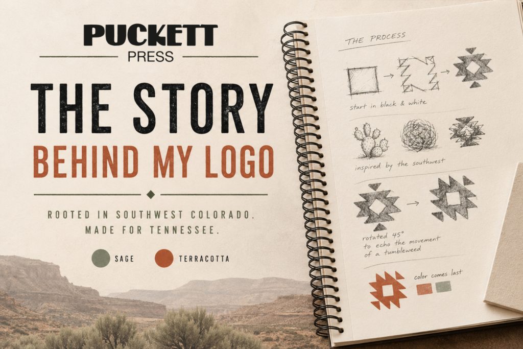
Every Great Logo Starts in Black & White
One of the principles I follow in every logo project is simple:
If it doesn’t work in black and white, it probably won’t work at all.
Removing color forces the design to succeed through shape, balance, proportion, and contrast. Once the foundation is strong, color becomes an enhancement—not a requirement.
Define the Direction
Before opening my laptop, I define the visual direction.
The goal was to create a logo that feels at home in Tennessee while avoiding design trends that may quickly become dated.
Country-inspired branding is making a resurgence, but timeless design outlasts trends.
Instead of following what’s popular today, I focused on visual elements that have remained recognizable for generations.
Research Before Sketching
Every project starts with inspiration—not imitation.
For this logo I explored themes including:
✓ Southwest Colorado landscapes
✓ Aztec geometric patterns
✓ Prickly pear cactus
✓ Tumbleweeds
✓ Vintage Western typography
Rather than copying these elements, I looked for what they shared.
Most featured:
- Bold silhouettes
- Sharp angles
- Simple geometry
- Strong contrast
Those became the building blocks of the final mark.
Simplify Everything
A logo shouldn’t require explanation.
Instead of illustrating a cactus or tumbleweed directly, I reduced those ideas into a clean geometric symbol.
Simple logos are:
✔ Easier to recognize
✔ Easier to reproduce
✔ Easier to remember
Less detail often creates more impact.
Adding Movement
Once the shape was complete, I rotated it 45 degrees.
This wasn’t just a stylistic decision.
The angle was chosen to mimic the movement of a tumbleweed rolling across the landscape.
It’s a subtle detail, but it gives the mark energy without sacrificing simplicity.
Color Comes Last
Only after the logo worked in black and white did I introduce color.
The primary color is Terracotta (#B65E3C), paired with Sage Green throughout the Puckett Press brand.
These colors reference the landscape of Southwest Colorado while complementing the Western heritage found throughout Tennessee.
The result is a brand that reflects both where we came from and where Puckett Press now calls home.
The Final Mark
Every design decision serves a purpose.
- Start with strong fundamentals.
- Research before designing.
- Simplify relentlessly.
- Add movement intentionally.
- Use color to reinforce the story—not create it.
A logo is more than artwork.
It’s often the first impression a business makes, and the strongest logos continue telling that story for decades.